
25 Awesome Examples of About Us Pages via @alexanderkesler
Your About Us page is one of the most important pages on your website.
An About Us page is your chance to tell the world:
- Who you are.
- What matters to you.
- What you do.
- How you do it.
It’s often one of the first stops when someone visits your website or blog.
An About Us page may be a deciding factor before you convince someone to convert, whether that comes in the form of:
- Making a purchase.
- Downloading an awesome piece of content.
- Signing up for your newsletter.
- Requesting information or a demo.
So how do you make your About Us page awesome (or more awesome??
ADVERTISEMENT
CONTINUE READING BELOW
What Makes a Great About Us Page?
Your About Us page should be:
- Informative. It doesn’t always have to tell your whole story, but it should at least provide people with an idea of .
- Contain social proof, testimonials, and some personal information that visitors can relate to, such as education, family, etc.
- Useful.
- Engaging.
- Easy to navigate.
- Accessible on any device.
Does that all sound complicated?
It really isn’t.
The main purpose of your About Us page is to give your visitors a glimpse into who you are as a person or a business (or sometimes both).
As users discover your brand, they need to distinguish what sets you apart and makes you… you.
This often requires finding the right balance between compelling content and a design carefully planned to look the part.
Conveying your identity in a fun and approachable – but also reliable and informative – way is challenging.
If you know who you are and your goal for your site, the About Us page should come naturally.
However, if you’re looking for some inspiration, you can always check out the following 25 awesome examples of About Us pages.
ADVERTISEMENT
CONTINUE READING BELOW
These examples will help you build a personal and engaging website journey.
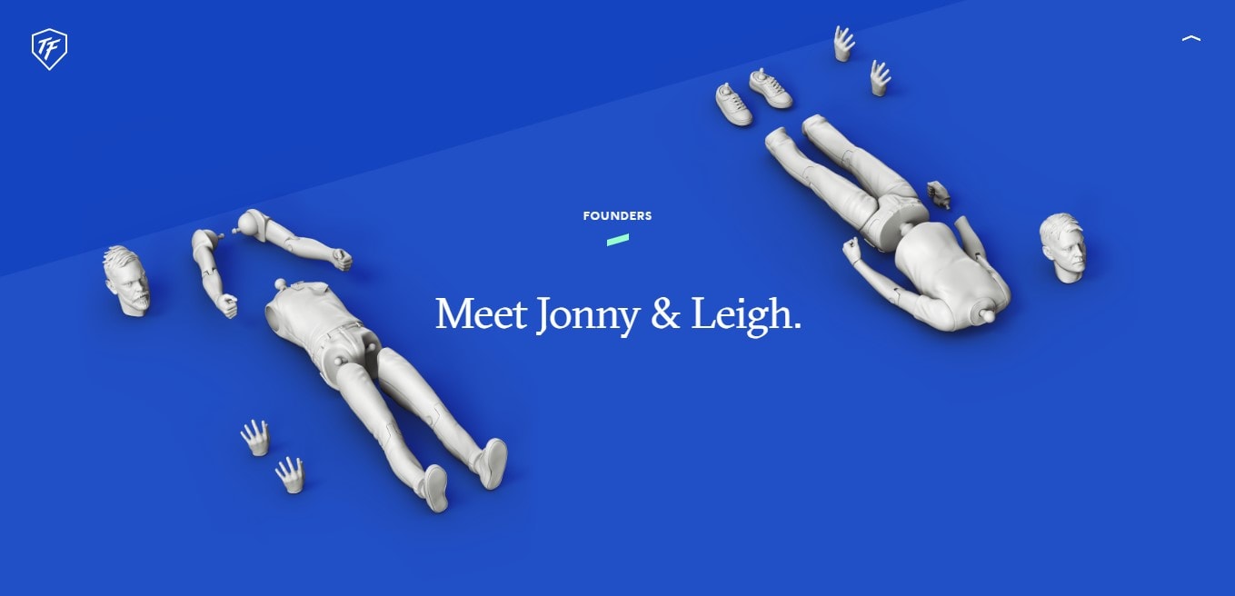

ToyFight is an award-winning creative design agency.
You’ll find the About Page at the top of the menu under the Who section.
This page has a unique feel, thanks to the deconstructed action figures representing the founders, Leigh Whipday and Jonny Lander.
The great attention to detail and interactivity also reflect the company’s 16 years of experience.
To sum up, this page stands out by providing the perfect mix of fun and information.
2. Band
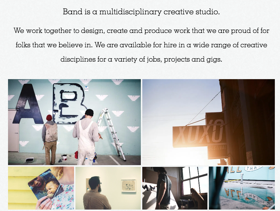

Band is a multidisciplinary creative studio based in the Pacific Northwest.
Their About Us page stands out by showcasing some of their unique and creative projects.
No number of words could hope to tell one of their potential clients nearly as much as these pictures can.
In this case, the 25 pictures featured on Band’s About Us page are worth much more than the 170 actual words you’ll read on the page.
The magical visuals and overall simple look and feel makes this About Us page one of our top picks.
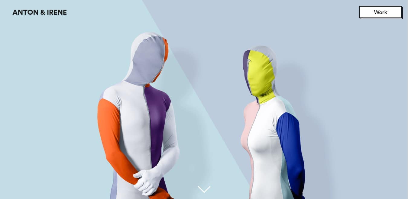

This might be the most distinctive website we’ve come across.
Anton & Irene is a design agency based in Manhattan.
Why are they a distinctive web presence?
Because their page takes parallax scrolling to the next level.
The snowy effects, bold colors, and quirky visuals create a truly captivating experience
ADVERTISEMENT
CONTINUE READING BELOW
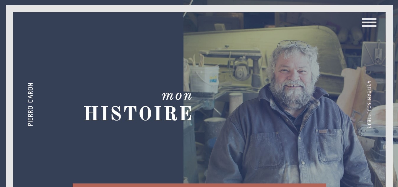

Pierro Caron is a French artisan sculptor.
Want to know our favorite part about his page?
The honesty.
Here is a man with great respect for wood and handcrafted sculptures that “tell a story and testify to the richness of one of our most precious resources.”
His website is light, easy to read, and filled with inspiring quotes and photos of his labors of love.
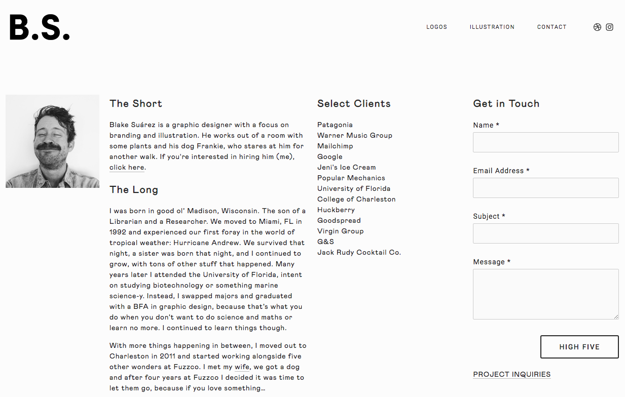

Who doesn’t love a good bio?
ADVERTISEMENT
CONTINUE READING BELOW
Especially one that starts with “I was born in good ol’ Madison, Wisconsin. The son of a Librarian and a Researcher.”
It also goes on to tell you how he and his family survived Hurricane Andrew and how his sister was born that night.
Who is this guy?
Blake Suárez is an illustrator and designer with a fantastic sense of humor.
His quirkiness comes through thanks to his humorous tone and goofy picture.
The page, while minimalist in design, offers a glimpse into Suárez’s colorful personality and his impressive block of work.
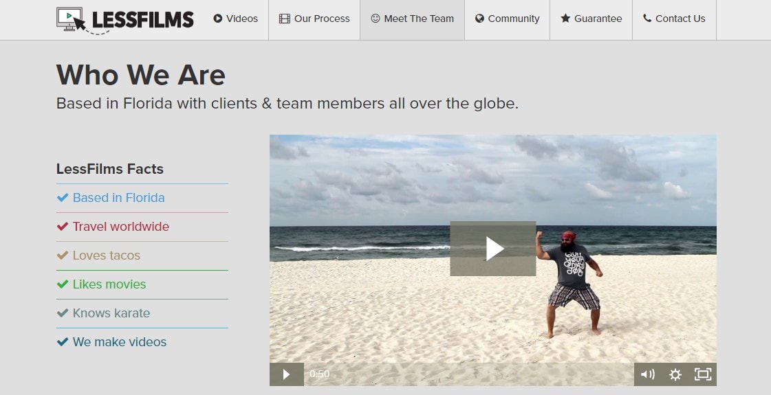

If you were a “super awesome” video business, what medium would you choose to show people what you do?
Video, of course.
LessFilms is a video production company based in Florida with clients and team members all over the world.
ADVERTISEMENT
CONTINUE READING BELOW
On their about page, you’ll find a humorous 50-second video along with a short list of facts summarizing their love for tacos, travel, and karate – a theme which certainly permeates most of the content on the website.
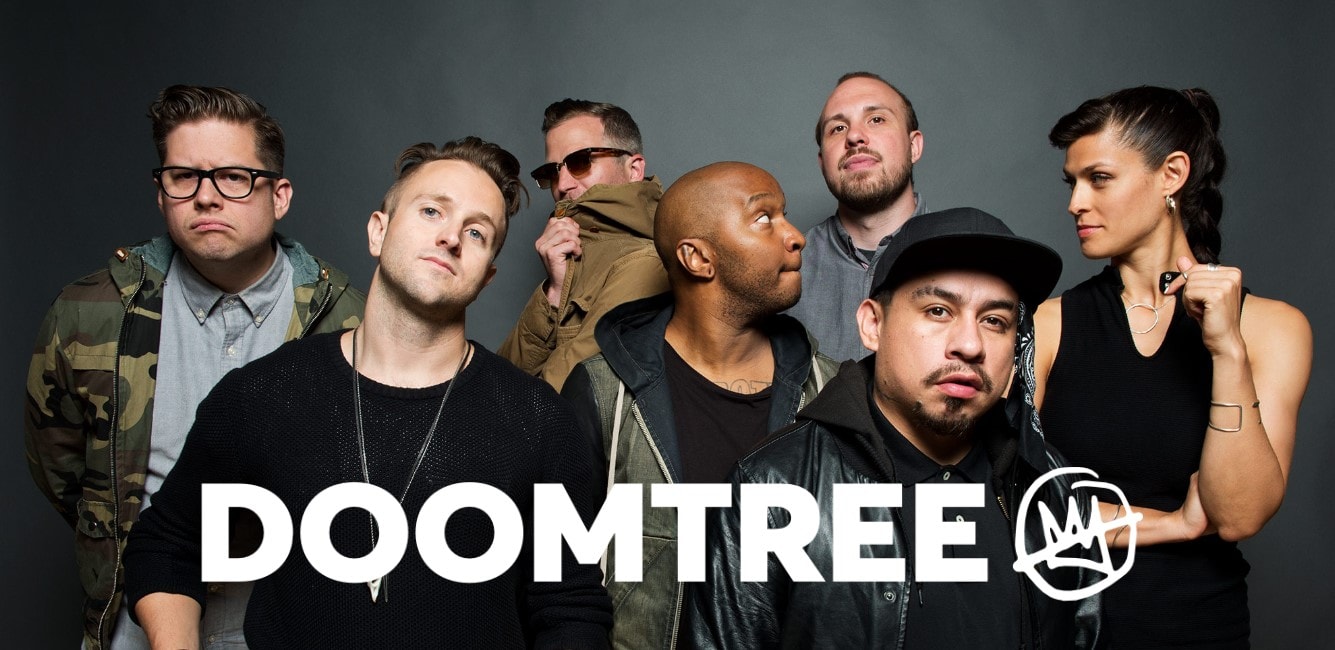

DoomTree’s page starts off as a coming-of-age story about how “a mess of friends” built the record label that made them a household name in Minneapolis.
However, it’s really the audio and the visuals that got us hooked.
Why tell, when you can show, right?
Explore their About Us page to meet the crew, listen to their songs, and get the latest news.
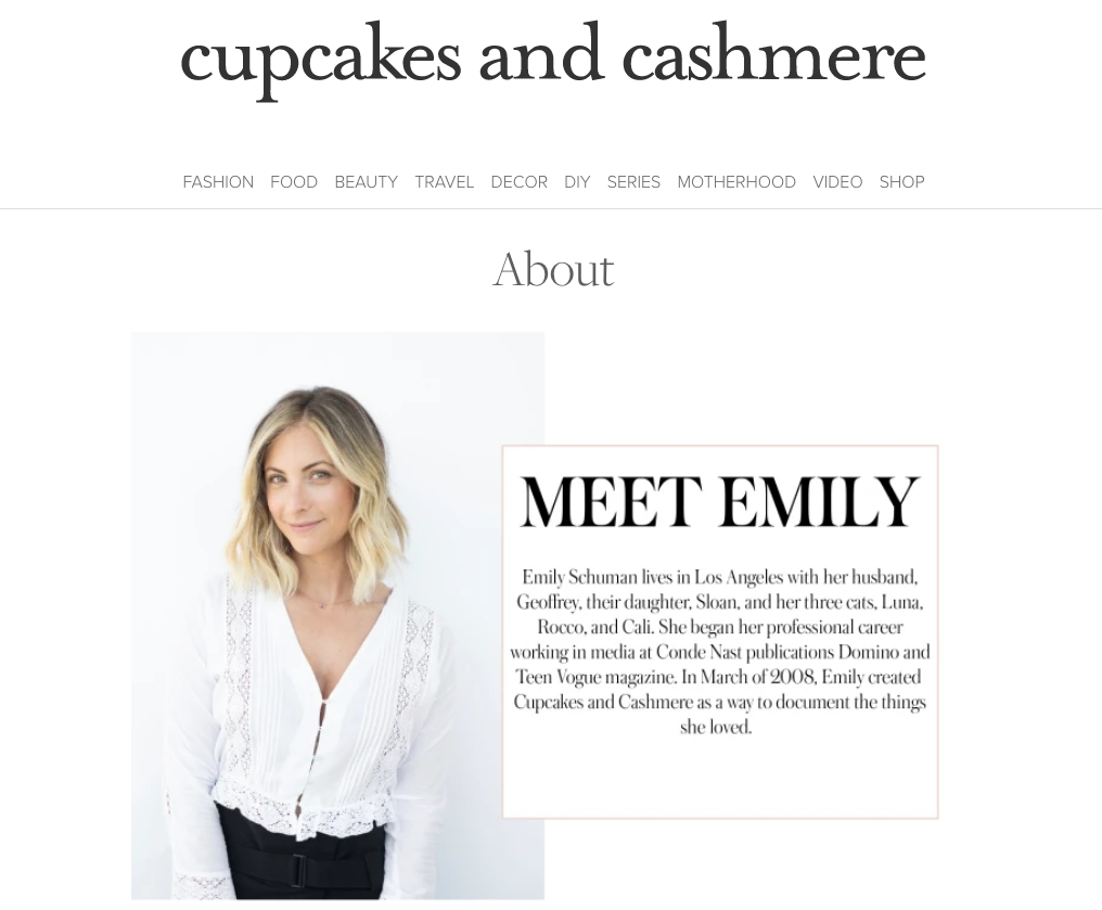

On this website’s main page you will find everything lifestyle related – fashion, food, beauty, home decor and more.
ADVERTISEMENT
CONTINUE READING BELOW
But it’s the About section that introduces you to the team that makes this website an endless source of inspiration.
The page introduces founder Emily Schuman, as well as her blog, books, and fashion collection.
Want to stay in touch?
No problem – the page also features useful links to her social media pages, as well as her online shop.
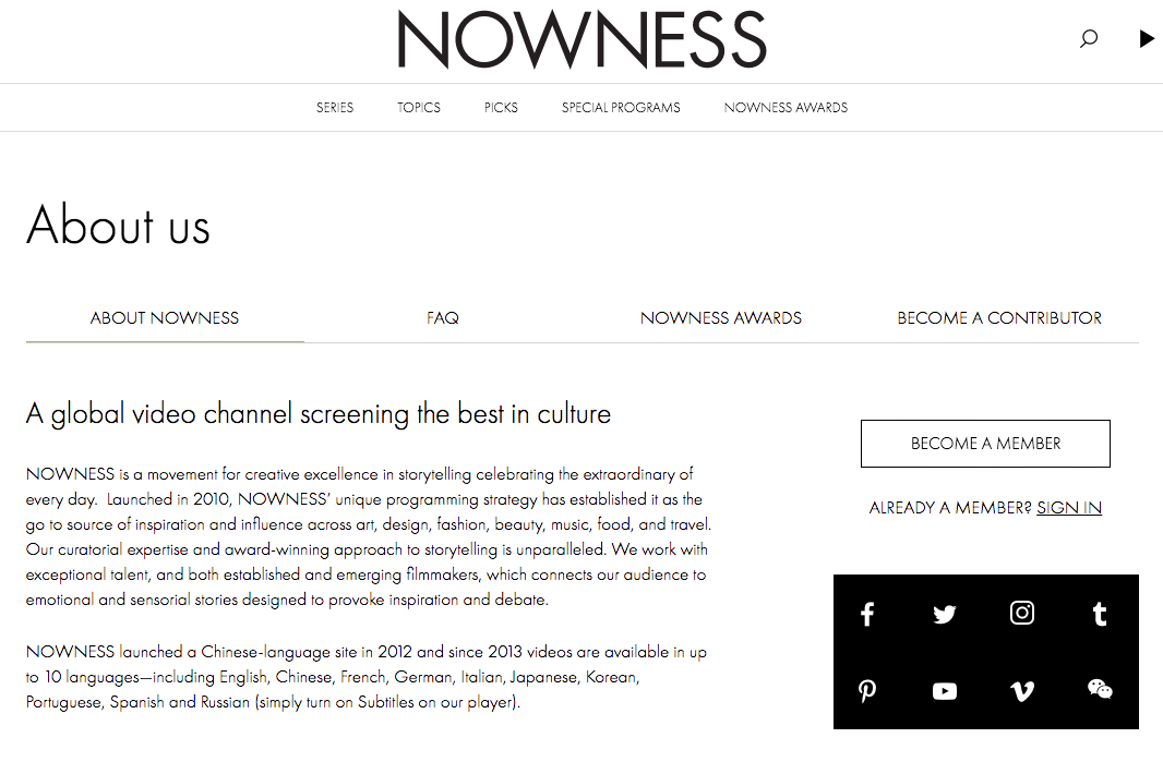

NOWNESS is a video channel providing the best in global arts and culture.
Therefore, it’s only natural that their About Us page features a compilation of various videos they host.
The content’s diversity and the team’s curatorial expertise are another reason to keep you browsing.
To stay in line with their video-centric aesthetic, the text on their page is short and concise.
However, it still provides enough guidance for browsing the website and even contributing.
ADVERTISEMENT
CONTINUE READING BELOW
Access the awards section and see why NOWNESS is currently a powerhouse in online film and video.
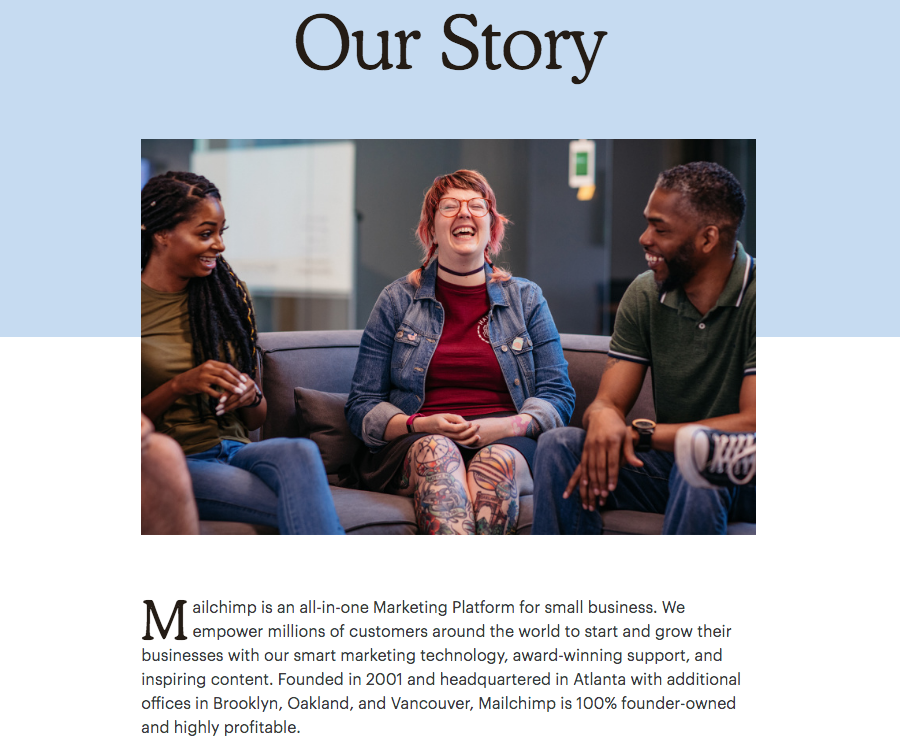

Millions of people use MailChimp every day to create, send, and track email newsletters.
That’s the clever part behind MailChimp’s About Page.
It’s a great example of how to use such a page as a sort of pre-sales platform.
It’s simple, fun and effective, quite colorful, and displays a welcoming mix of diverseness.
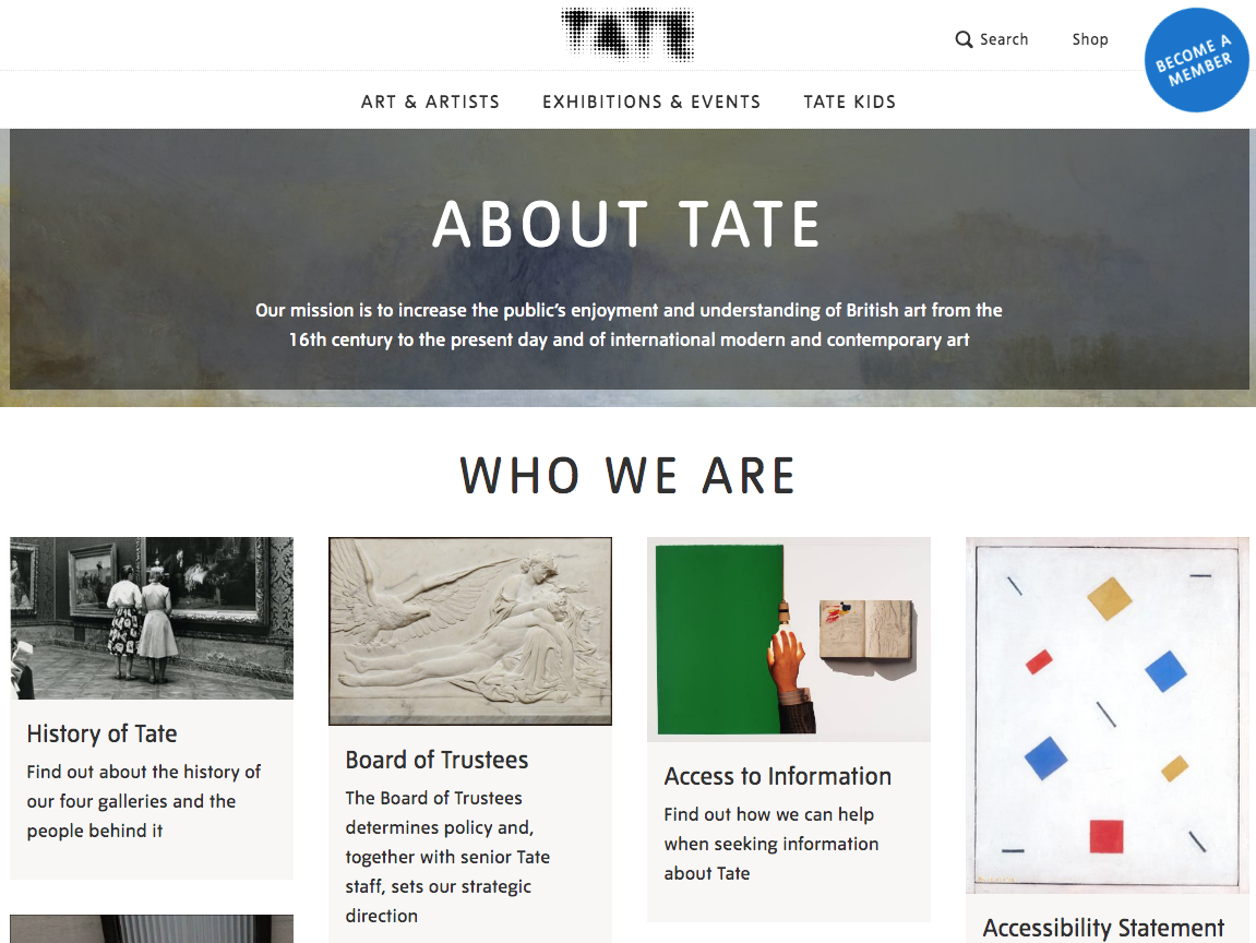

Tate’s About Us states that their mission is to “increase the public’s enjoyment of British art […] and international modern and contemporary art.”
ADVERTISEMENT
CONTINUE READING BELOW
So said, so done.
How come?
Because this page eases the journey for any reader seeking to take them up on their mission.
Scroll down to find out who they are, how to stay in touch and everything in between.
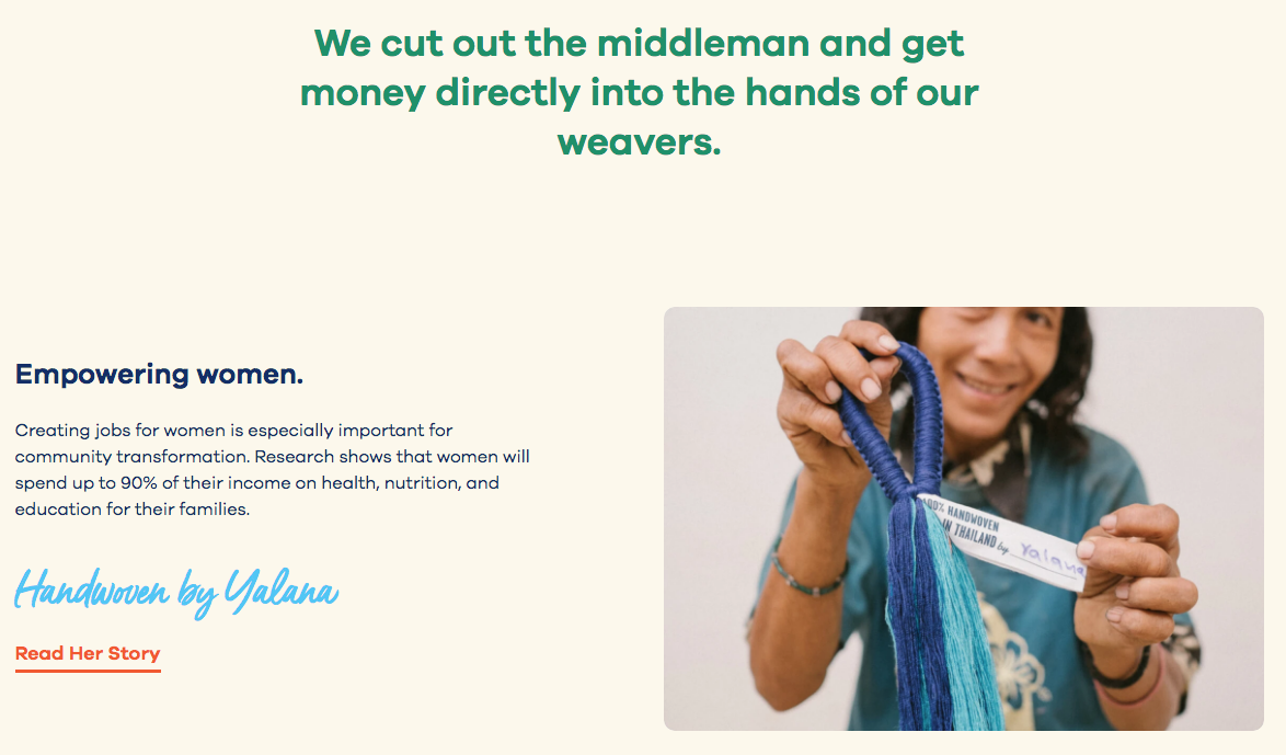

Yellow Leaf Hammocks is trying to save the world one hammock at a time.
Their goal is to break the cycle of extreme poverty by empowering local artisans in Thailand to earn a stable income.
The brand’s About Page is filled with uplifting stories of impeccable craftsmanship and tight-knit communities.
As a result, it’s just as inspiring as their devotion to sustainable change.
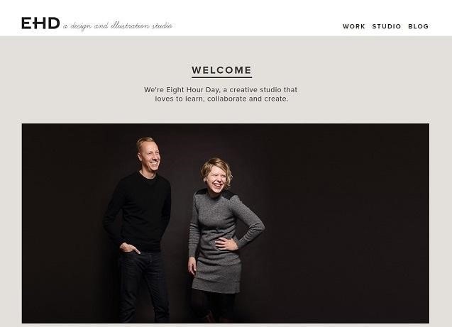

You had me at “hello.”
ADVERTISEMENT
CONTINUE READING BELOW
Well, that’s exactly how the About Us section of Eight Hour Day starts – a welcoming greeting.
For that reason, it also made us browse for more.
Why?
Because as much as you love good design and inspiring illustrations, you also want to meet the people that curate all the content for you.
Furthermore, it’s equally rewarding when you realize that they are just as eager to start a visual dialogue with you.
Nathan Strandberg and Katie Kirk are doing what makes them happy, and this is obvious throughout their page.
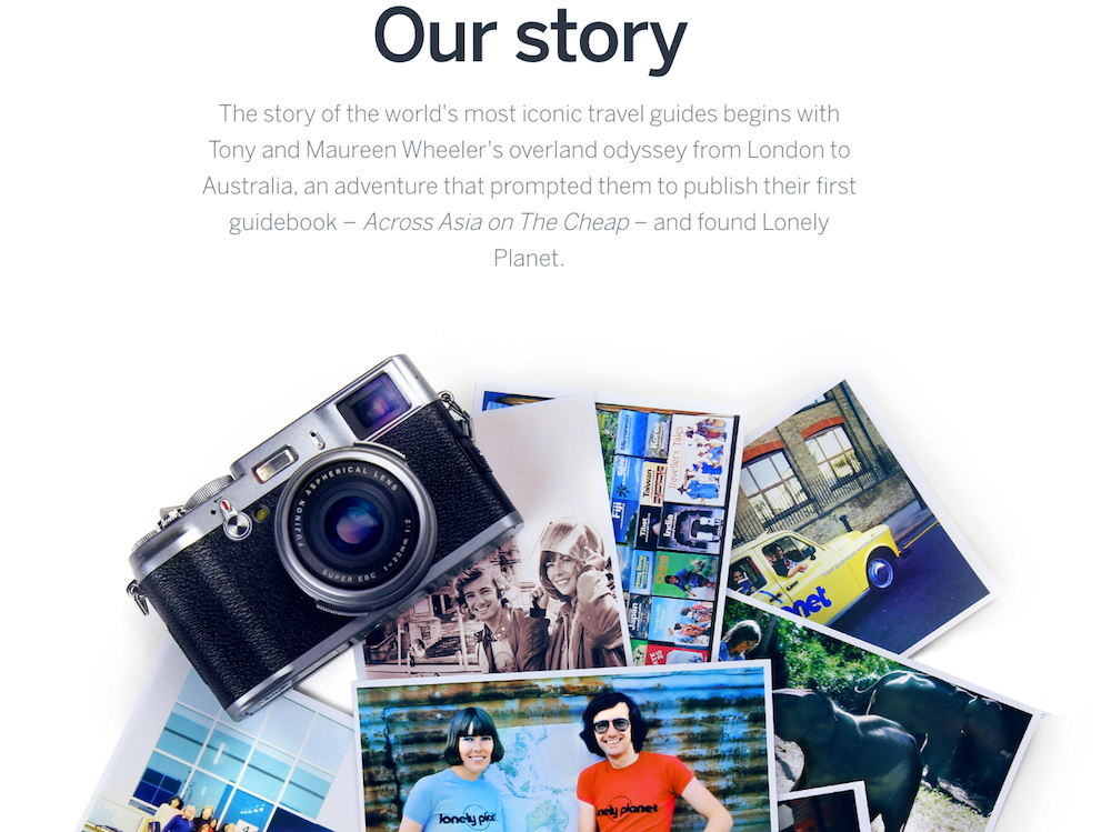

You know you’re about to hop on a journey when a website’s About Us page tells you to “Just go.”
This is a website for travelers, so the layout is perfect for those eager to explore.
ADVERTISEMENT
CONTINUE READING BELOW
As you scroll down, you discover what Lonely Planet stands for, and their visual aid offers a preview of their services.
The perks?
You see everything in one go and decide for yourself what you take on your journey.
Will it be their apps, their printed guides, or their website?
In any case, every resource becomes an inexhaustible well of travel inspiration.
So, are you ready to go?
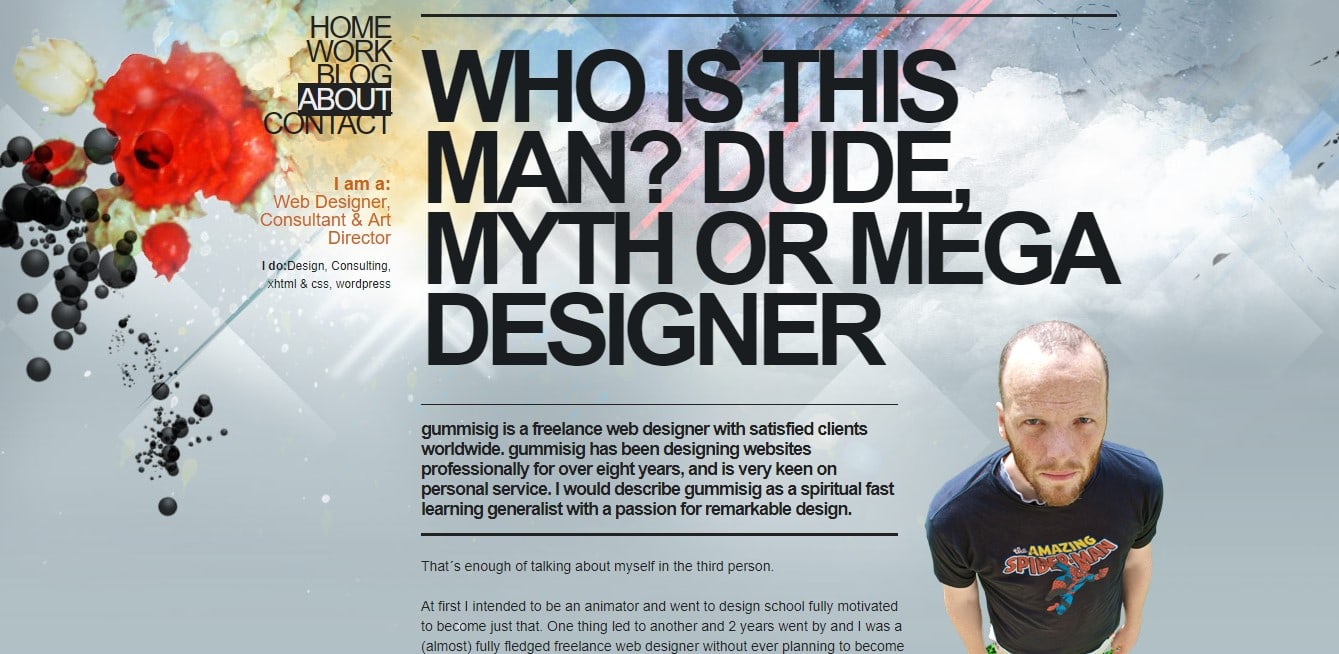

Gummisig is a freelance web designer who likes to talk about himself in the third person.
He also makes great use of over-sized text to bring attention to his work in a humorous manner.
Perhaps what’s striking about this page is that it introduces Gummisig’s portfolio, but also reflects his free spirit and commitment.
And while he mentions the household names he worked for in the past, he remains approachable and open to new collaborations.
ADVERTISEMENT
CONTINUE READING BELOW
Scroll down to discover his preferred action items.
Hint: he wants to know your secrets!
Perhaps the most striking feature behind this page is that it acts as a preface to the designer’s portfolio, mirroring his free spirit and a remarkable passion for design.
While he proudly states the companies he has worked for (IKEA is just one of the bigger names to pop up) he does so in a manner that is not boastful.
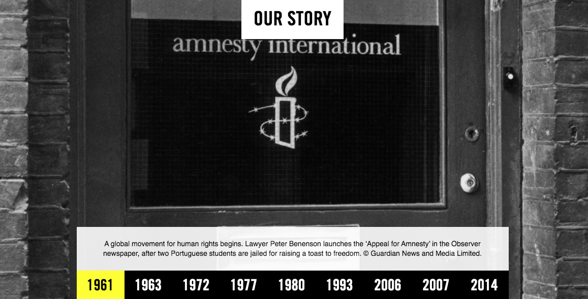

Amnesty International is more than an NGO.
It is a global movement of more than 7 million people that are campaigning for a better world, where human rights are central.
It is no wonder that the pronoun we is prevalent throughout their page.
Filled with quotes, videos, and testimonials, their page makes you believe that you can hope for a better world. And they have the facts to prove it, too.
ADVERTISEMENT
CONTINUE READING BELOW
If you scroll down, you can access all their accomplishments on the road toward better social change.
After you understand their global footprint, you should also imagine – imagine the possibility of a world where human rights are at the center of discussion.
Good enough reason to stay in touch, no?
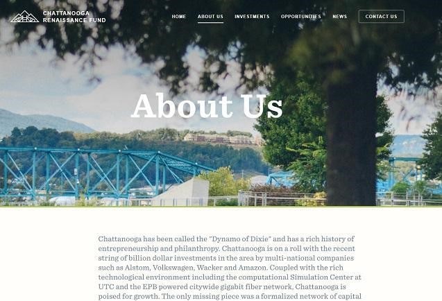

The top part of the Chattanooga Renaissance Fund page aims to attract entrepreneurs into the Chattanooga area of Tennessee.
How?
By describing its history and the companies that already invested there, such as Amazon or Volkswagen, to name a few.
Which begs the question: what prompted these companies to move there?
Find out by reading more about the fund’s members and how they contributed to its growth.
This is especially reassuring because they are also here to help you.
ADVERTISEMENT
CONTINUE READING BELOW
Whether you’re a startup, investor, or third party, the page has a dedicated section for all its users.
All you have to do is prove that you want to turn ideas into existence.
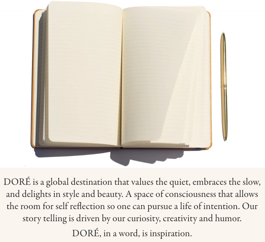

This website started off as a photography blog founded by Garance Doré.
Eventually, it became a place for inspiration with a growing team that’s eager to question everything.
Whether it is style, femininity, or modern dilemmas, no topic remains off limits.
Ready to contribute to the discussion? By all means, you are most welcome.
The team reads all your comments and is ready to turn your thoughts into their command.
Not sure where to start?
Scroll down to see their work in videos and use the pictures at the bottom to access their Instagram page.
ADVERTISEMENT
CONTINUE READING BELOW
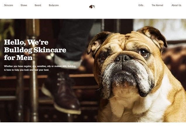

How can you convince men to delve into skincare?
You bring their best friend on their side – a dog.
Meet Bulldog Skincare, the company that aims to make skincare options dedicated to men readily available.
To have you sold, their About Us page greets you with the adorable mug of a bulldog.
This quickly becomes your guide to finding the products that will help you look and feel your best.
As you scroll down, you are growing familiar with the products and are slowly but surely befriending the brand itself and its values.
Their skincare is made from a mix of natural and carefully-selected man-made ingredients.
It’s also vegan and certified by Cruelty Free International.
Their page is so good, it’s no wonder they have a ‘Shop Now’ button every step of the way.
ADVERTISEMENT
CONTINUE READING BELOW
Don’t mind if I do.
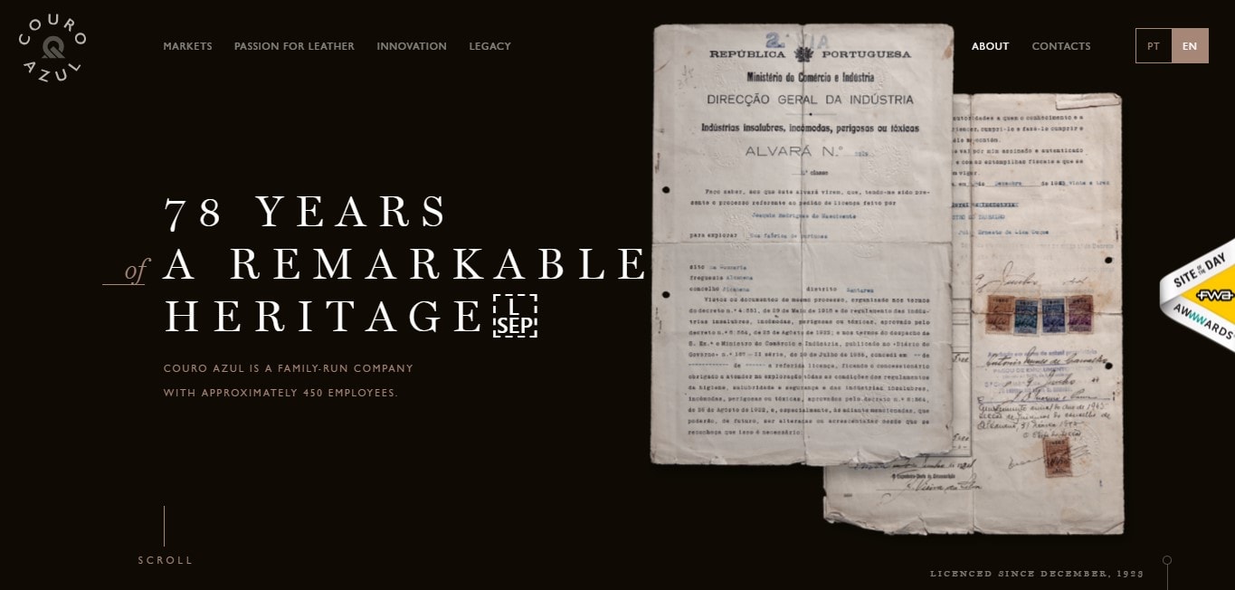

Navigating through Couro Azul’s About Us page is like a journey through the unknown.
The kind of journey that keeps you scrolling down for more.
The company makes leather upholstery for cars and trains, and its history and trajectory are equally fascinating.
In addition to the visual delight, the page is also interactive and engaging.
Why?
So that you can understand what the company values from a first browse: 100 percent in-house products.
Their certificate for ecologic distinction attests to their commitment to environmental best practices.
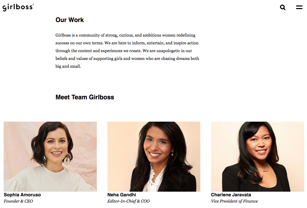

The entire Girlboss website is simply inspiring.
ADVERTISEMENT
CONTINUE READING BELOW
Sophia Amoruso’s brand aims to redefine success for millennial women.
Girlboss empowers them by providing the tools and connections they need to own their futures.
Furthermore, every bit of content you’ll find on this site oozes with passion, humor, and resourcefulness.
These key traits are sewn into the fabric of Amoruso’s success.
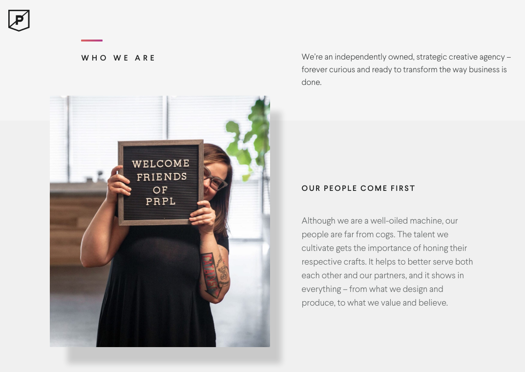

If you want people to understand your company’s values, then put them in bold black and white print – just like Purple, Rock, Scissors did.
Their entire website is a technological marvel.
With its quaint background animation, concise content, and creative visuals, this page is definitely an eye-catcher.
There’s also an openness about it that will unfailingly draw you in.
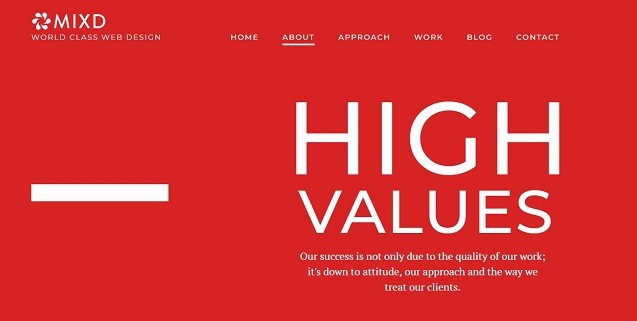

It’s not often that you see an About page that puts so much emphasis on its “meet the team” section.
ADVERTISEMENT
CONTINUE READING BELOW
Each member is portrayed with a short description and an almost full-body shot, complete with their social media accounts.
Boasting big, bold elements and sharp colors, this page excels at making a great first impression.
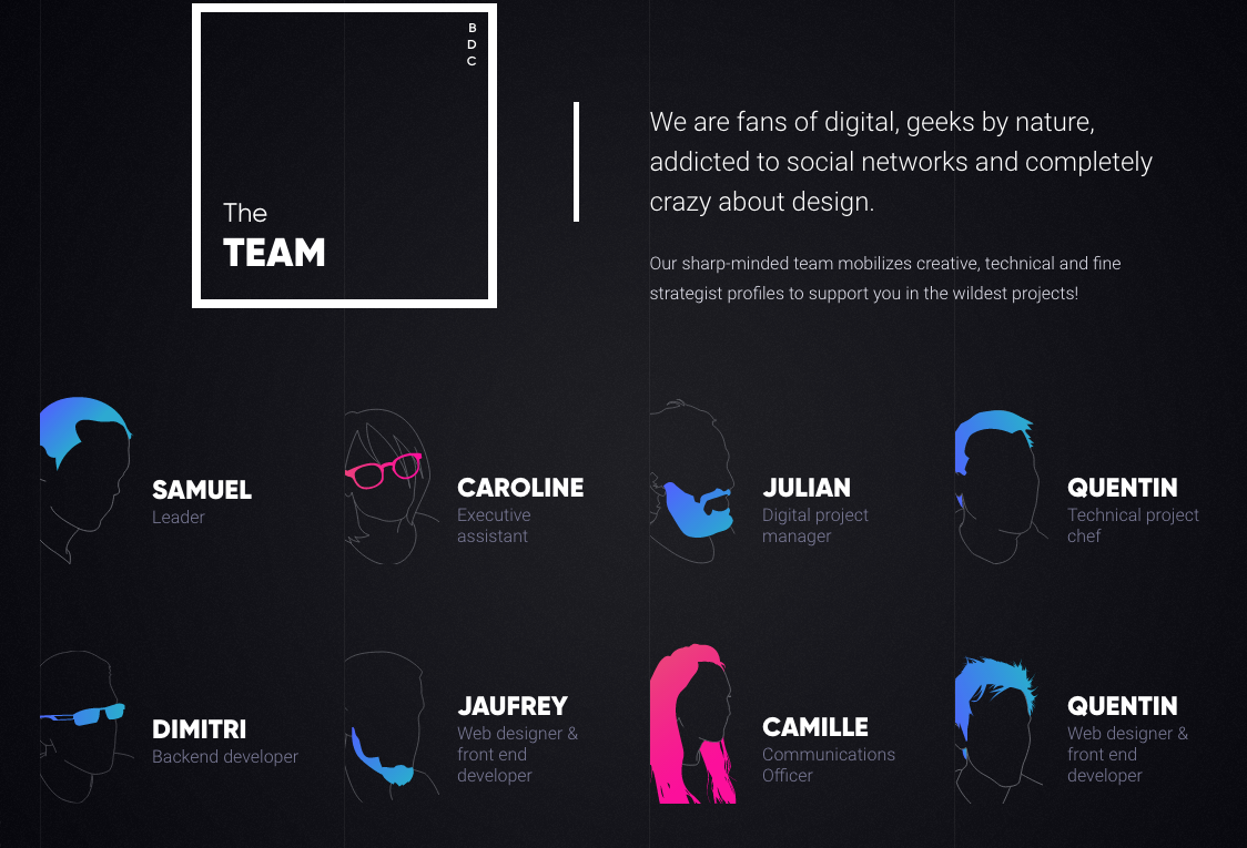

There are many things we love about this website, but for brevity’s sake we’ll narrow it down to two.
First, their main page is highly interactive.
The simple act of pushing a key or moving the mouse reveals a key piece of info about the brand. Because of that, it feels like watching a modern silent movie.
The second thing is the way 6tematik introduces us to its team. Each member is portrayed by a minimalist caricature that is defined by one obvious trait. Some have long pink hair, others a bushy beard or big glasses.
ADVERTISEMENT
CONTINUE READING BELOW
These traits add a touch of personality to each member’s portrait, without giving too much away.
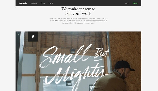

Made by artists for artists, Bigcartel is an online platform that makes it easy to build and manage an online store.
The simple yet impactful mission statement and the candid employee photographs make this About page refreshingly different.
Each photo in the gallery is unique and personal.
As a result, you won’t find any staged or boring ID-badge-type photos – just a wonderful display of diversity.
More Resources:
ADVERTISEMENT
CONTINUE READING BELOW
Image Credits
All screenshots taken by author, July 2018


